Web Page Templates
This guide explains Web Page Templates which forms a part of the Rule based personalisation offerings.
Web Page element requires no additional integration steps and is available to all accounts live on Rule based personalisation.
Of a Rule based personalisation campaign, the Setup, Audience and Schedule pages remain as any other Rule based personalisation campaign and nothing additional needs to be done.
Home Hello Bar
The template Home Hello Bar enables you to display multiple promotional messages on a single banner area leveraging several types of animations. Maximising the possibilities of limited real estate.
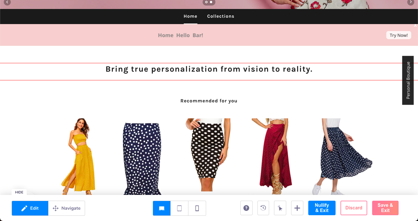
How to setup a Home Hello bar?
Complete the Setup section of the campaign, select the required Web Page(s) you are targeting.
Complete the Audience selection, select your required qualifying rule(s).
In the Personalisation section, Click on edit. Once the editor opens:
-
Click on the element selector where you want the hello bar is to be placed.
-
A Dialogue pop up appears, click on the "Add element option".
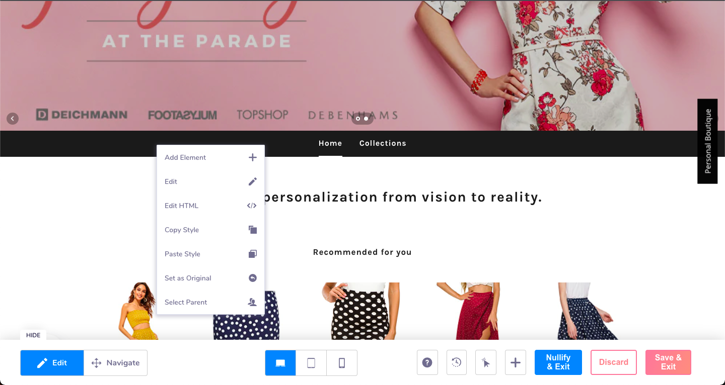
-
Once you click on the "Add element" option, that opens a drawer with the available templates.
Click on Home Hello bar. Other templates will follow soon
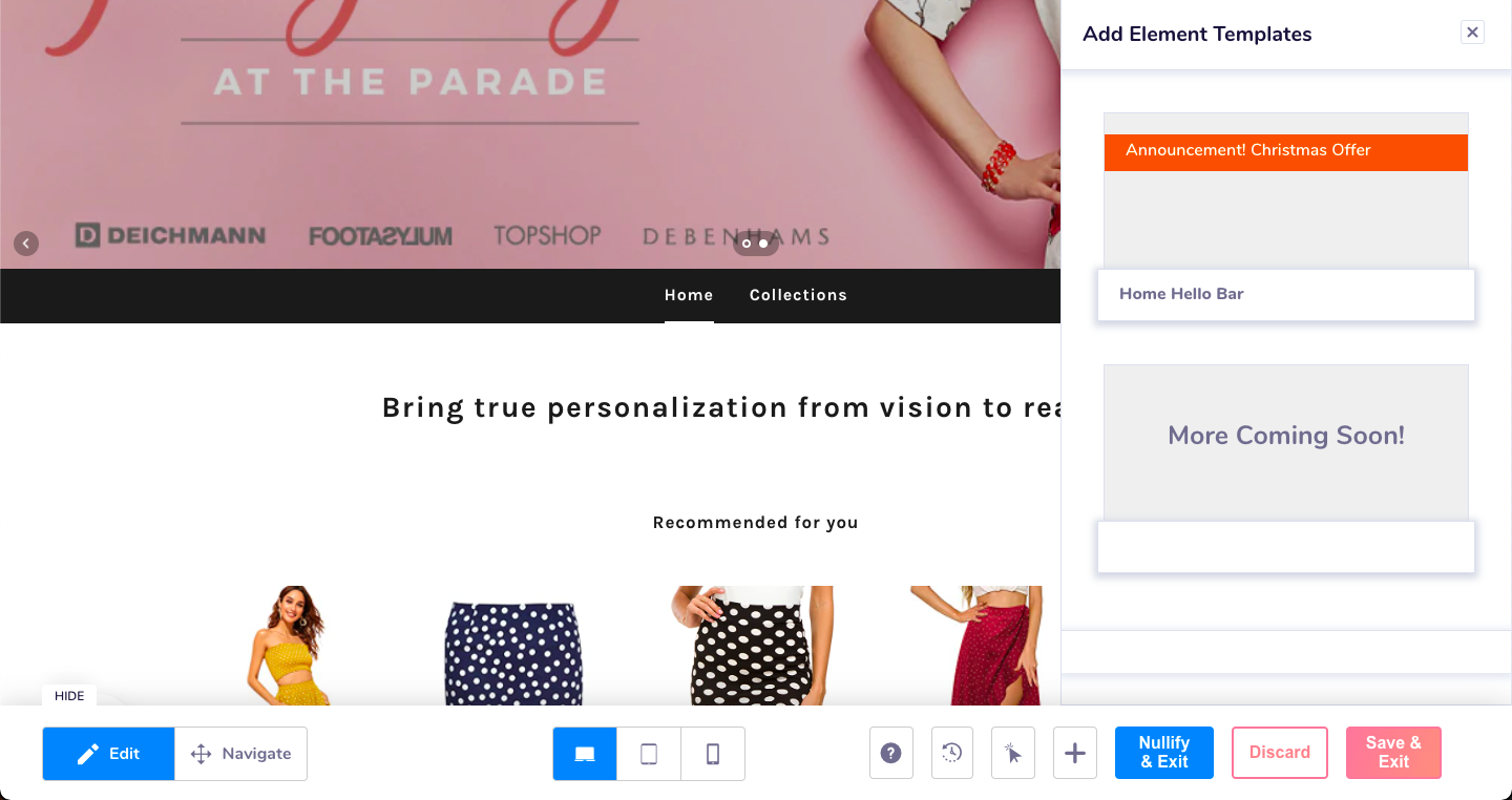
- Clicking on the template opens the configuration section with options of Position, settings, messages, typography etc.
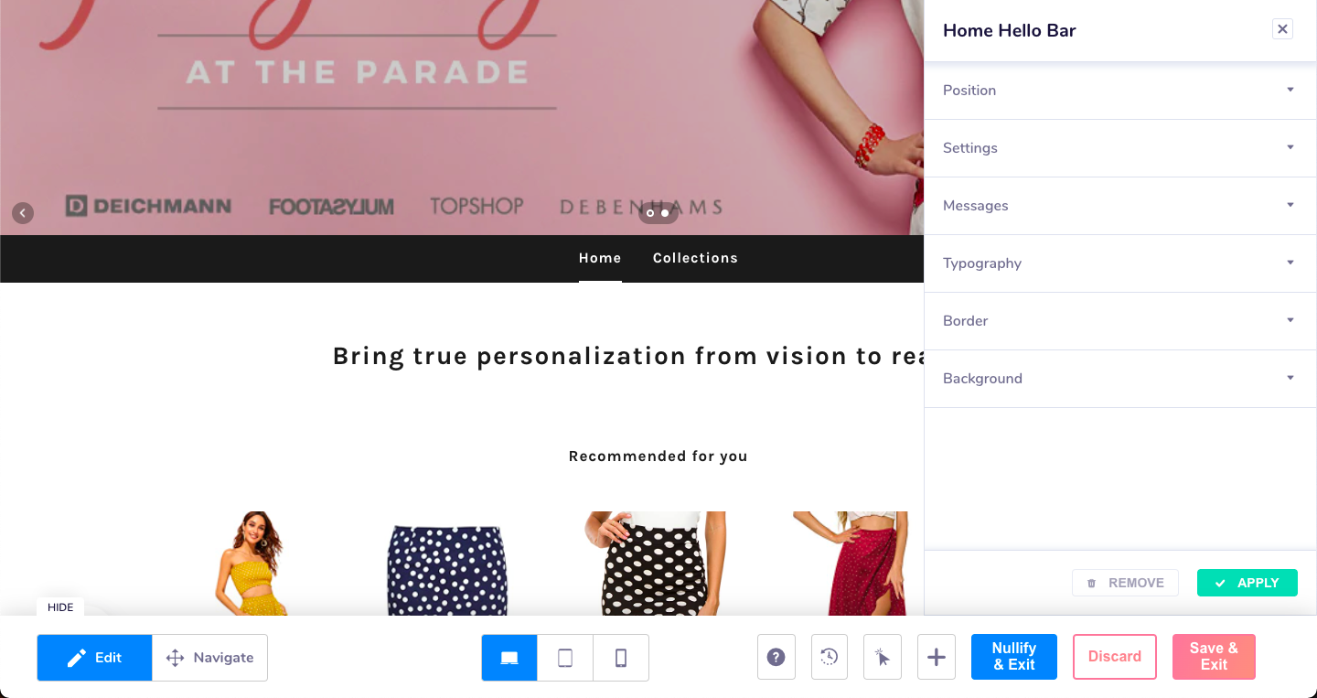
Position
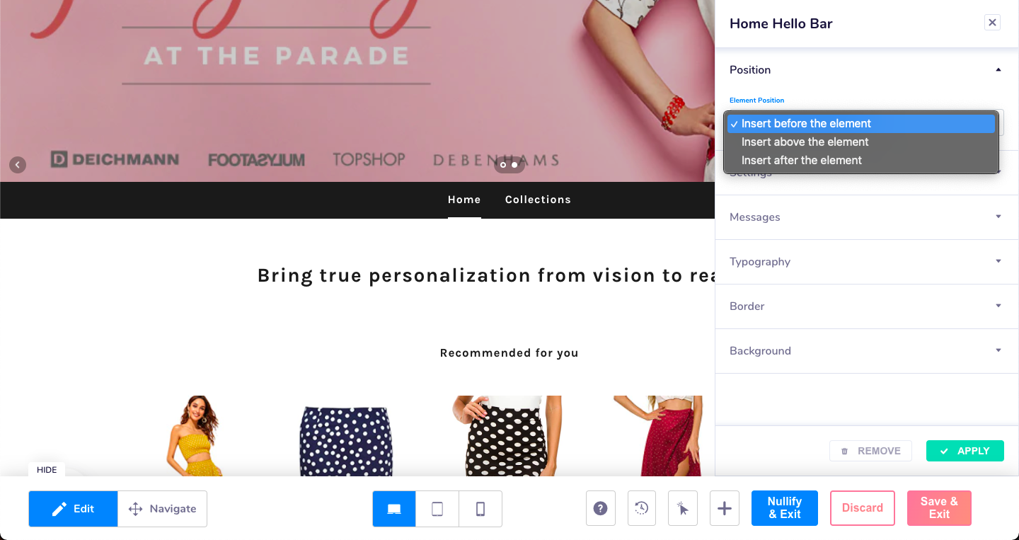
- Click on "Position" option to place the hello bar at the desired position. You can place the bar,
-Before the selected base element
-Above the selected base element
-After the selected base element
Following are a few references
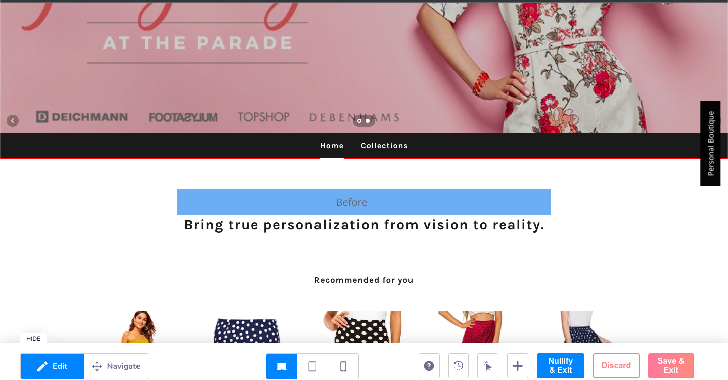
Before
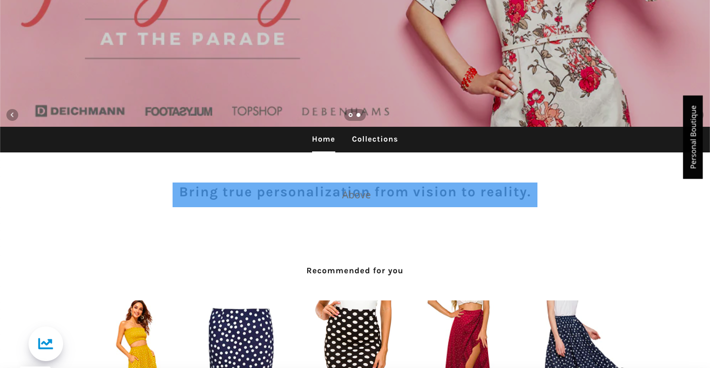
Above
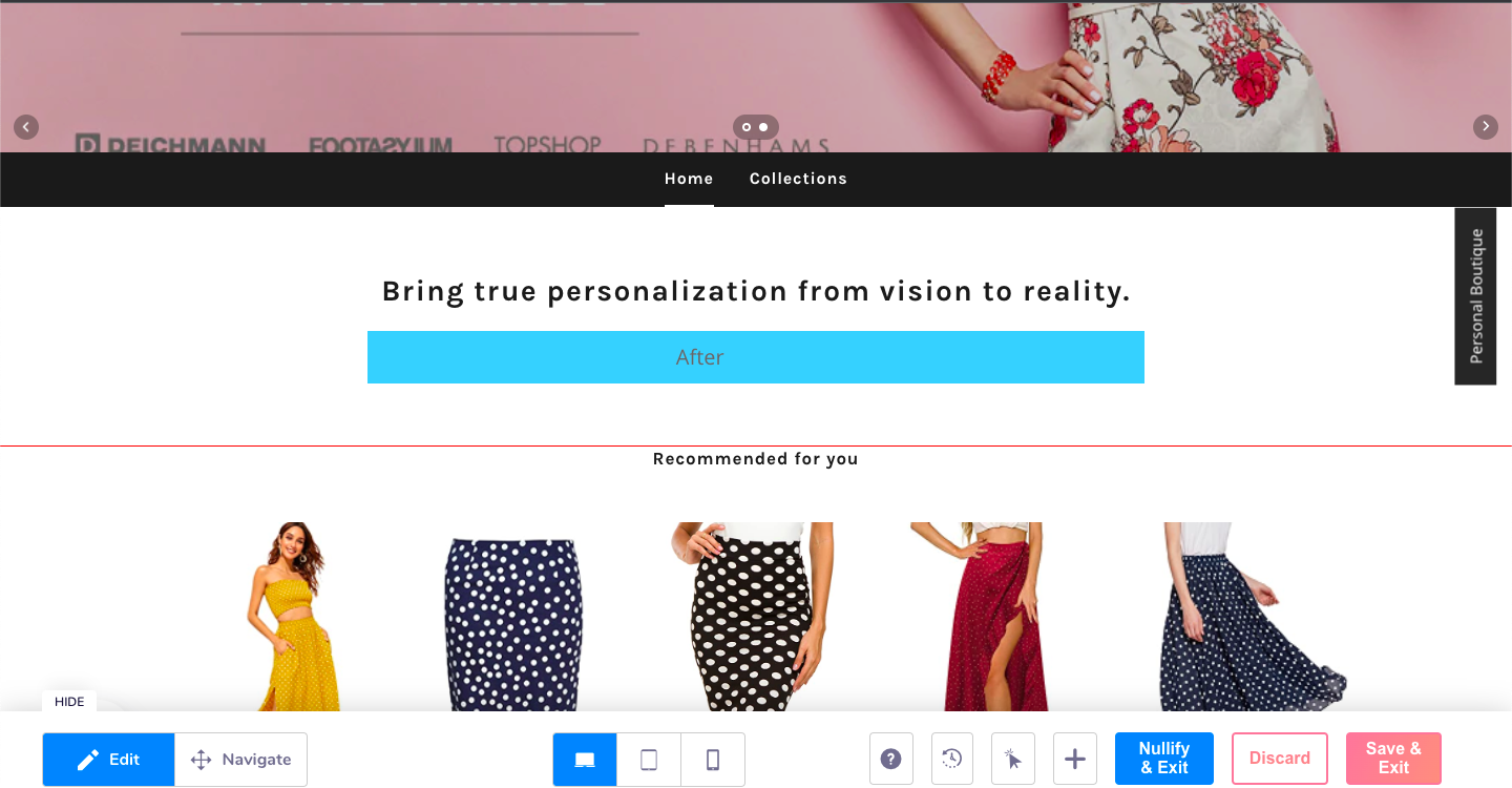
After
Settings
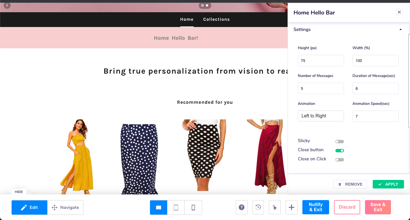
- Click on the "Settings" option to setup the height, width, No of messages (max 5), Duration of the message, Animation type (Left to right, Right to left, Top to Bottom, Bottom to top and coin flip) and the Speed of the animation.
You can also add stickiness (Freeze of the bar against scroll), Close button and initiate close on click of the bar.
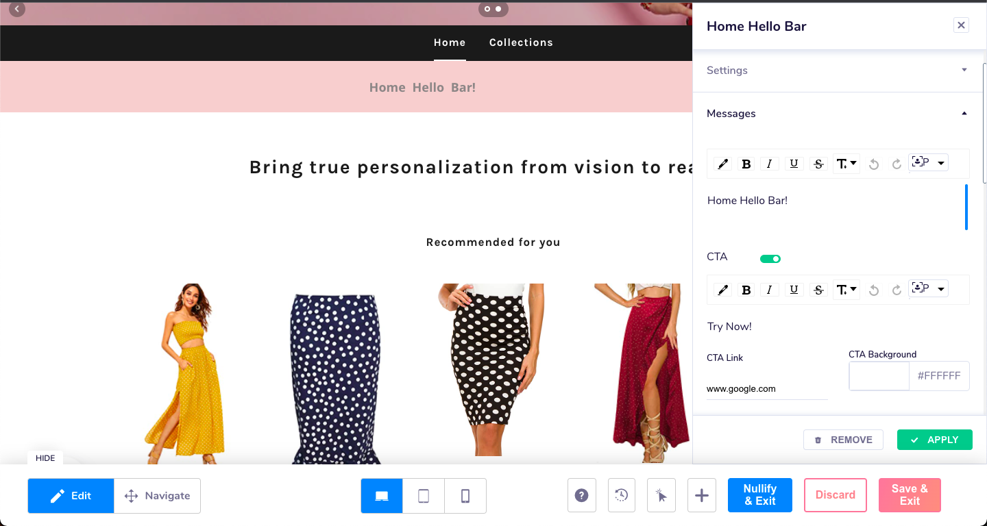
- Messages section allows to add the Different messages that are available through the animated transitions (maximum of 5) along with the CTAs, if any.
Typography
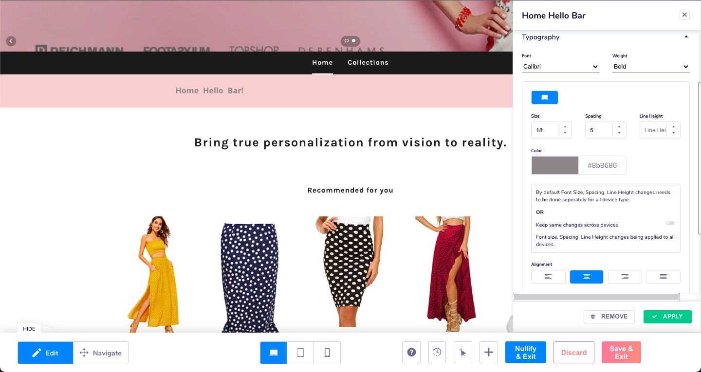
- In the typography section, select the font colour, style size, alignment among others.
Border
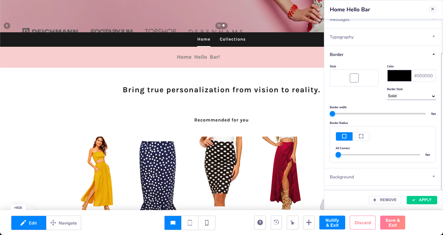
- In the border selection, choose the desired border width and colour
Background
- In the background selection, choose desired background colour or image.
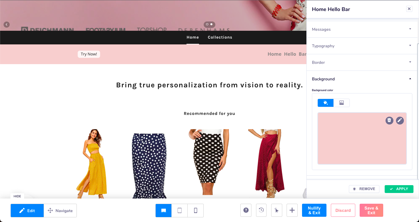
Thats it! your Home Hello bar is ready to go. Save and exit and then schedule your campaign.
Editing your Home Hello Bar
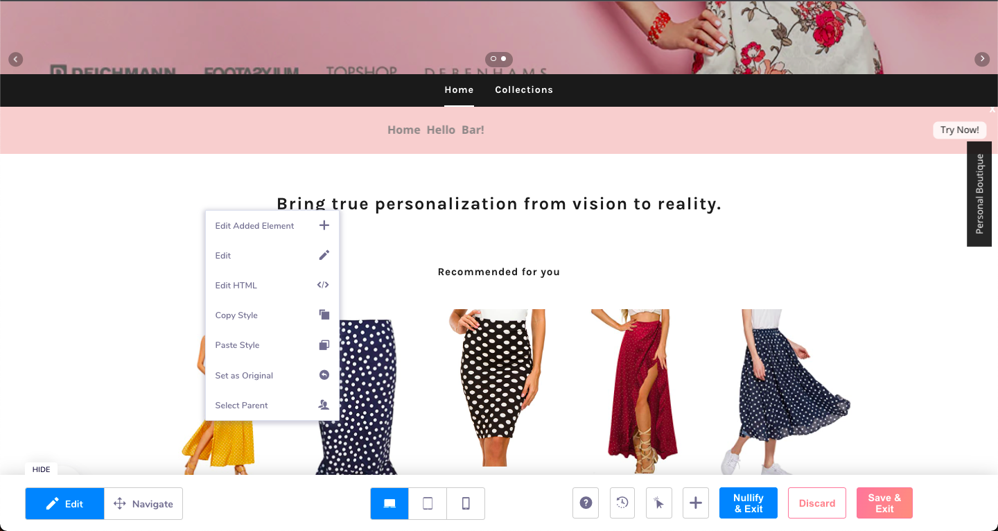
To edit the Home Hello, click on the base element on the reference of which the bar was placed. This opens up the dialogue pop up with the "Edit Element option".
Note
Please note if you are selecting the parent selection of any element, please ensure to click on the same parent element to access the edit option.
Tracking clicks on the Home Hello Bar
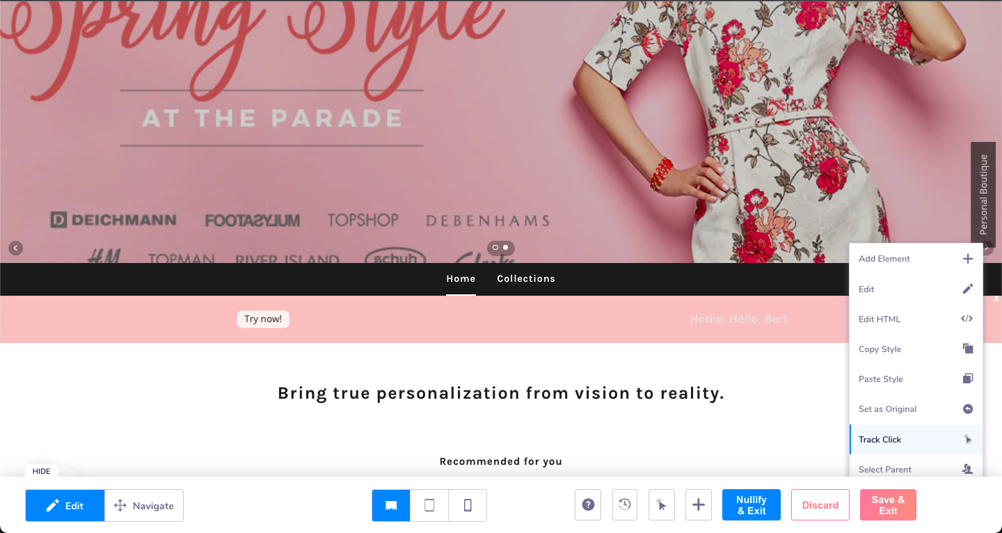
If you are assigning a CTA or even if the bar does not have a CTA, ensure that a track click element has been chosen for the bar.
Coupon on Sliding drawer
This element enables you to add upto 3 discount coupons in a sliding drawer to be seen and used by your customers anytime through their session on the website. You can add all your discounts coupons, exclusive offers in this drawer which is always accessible to all the users browsing your website.
How to set up coupons on the sliding drawer?
Position
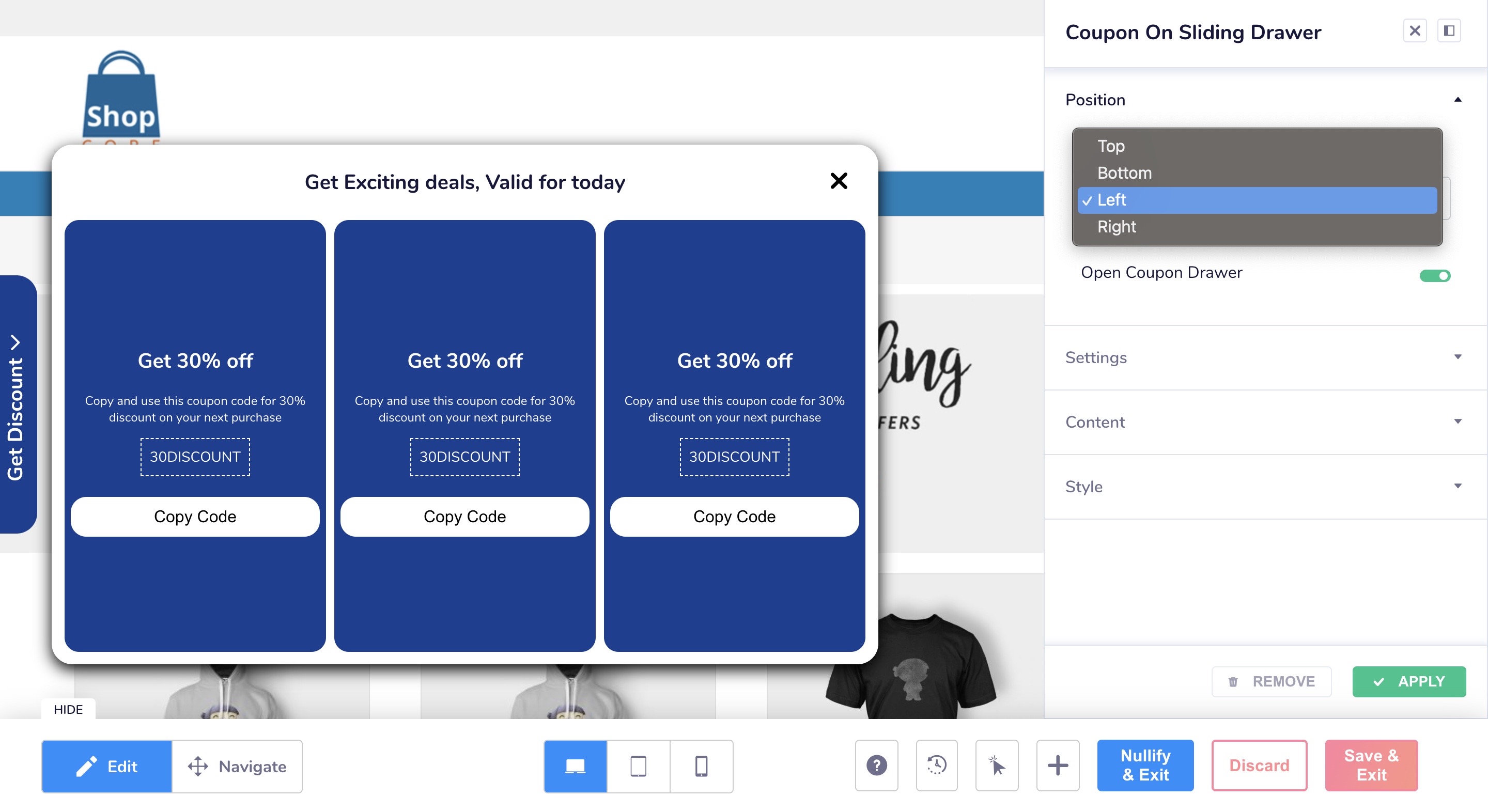
- This allows you to set the positions of the sliding drawer. It can either be at the top, bottom, right or left of the page.
You can also use the toggle on 'open coupon drawer' to view how the sliding drawer would looks in different positions on the screen.
Settings
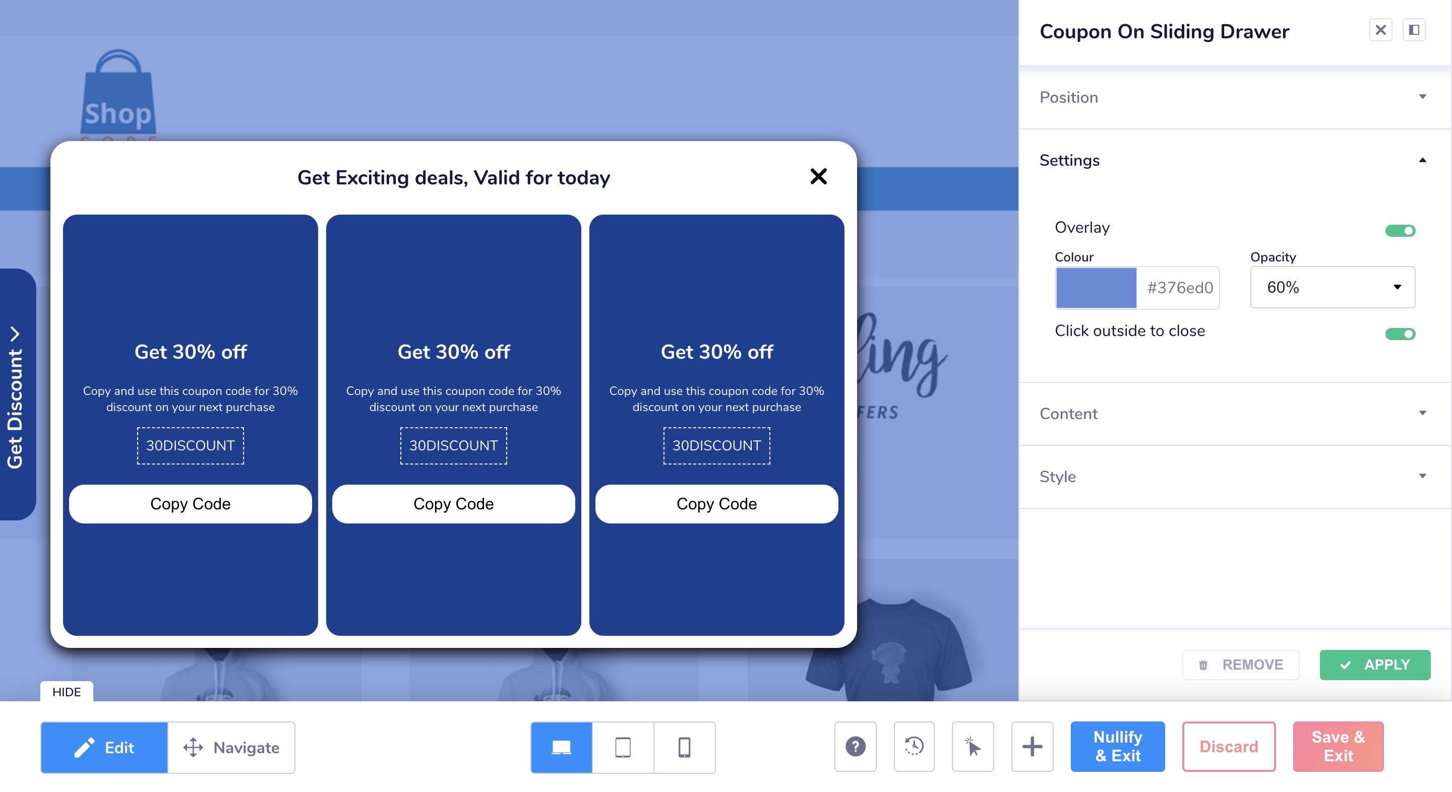
- In this section, you can either enable 'overlay' or 'click outside to close' feature. The overlay option will add the overlay on the entire screen when the coupon drawer is opened. You can also set the color and opacity of the overlay added.
Content
- You can add the 'text' and 'icon' to be shown on the closed drawer.
- You can also add a 'title' for the discount drawer as well as set the background color for it.
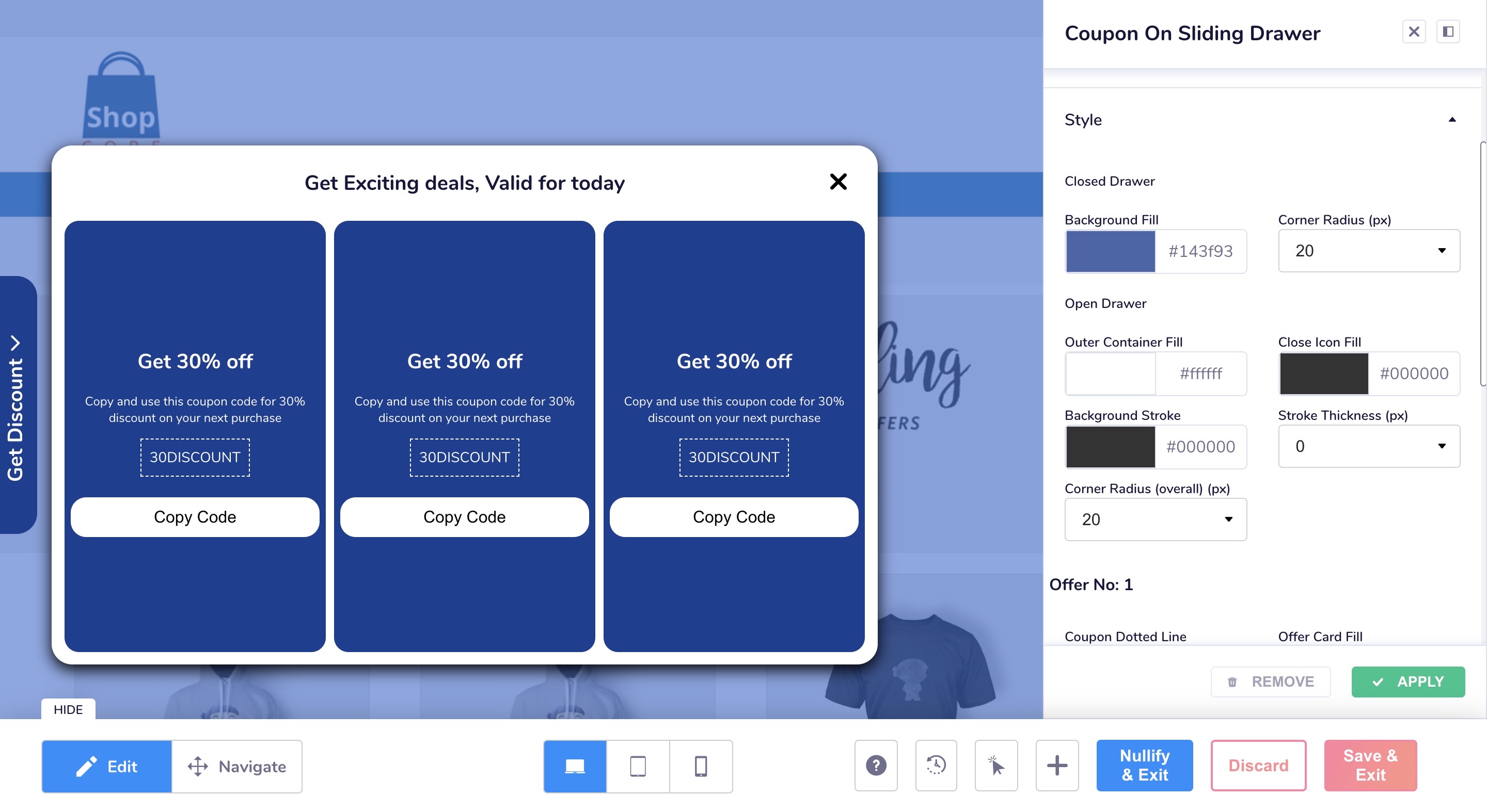
You can add upto 3 coupons in a single drawer. Each coupon can have 4 elements:
- Heading of the coupon
- Sub-heading of the coupon
- The actual discount code
- A button to copy the discount code
- Images if any
Style
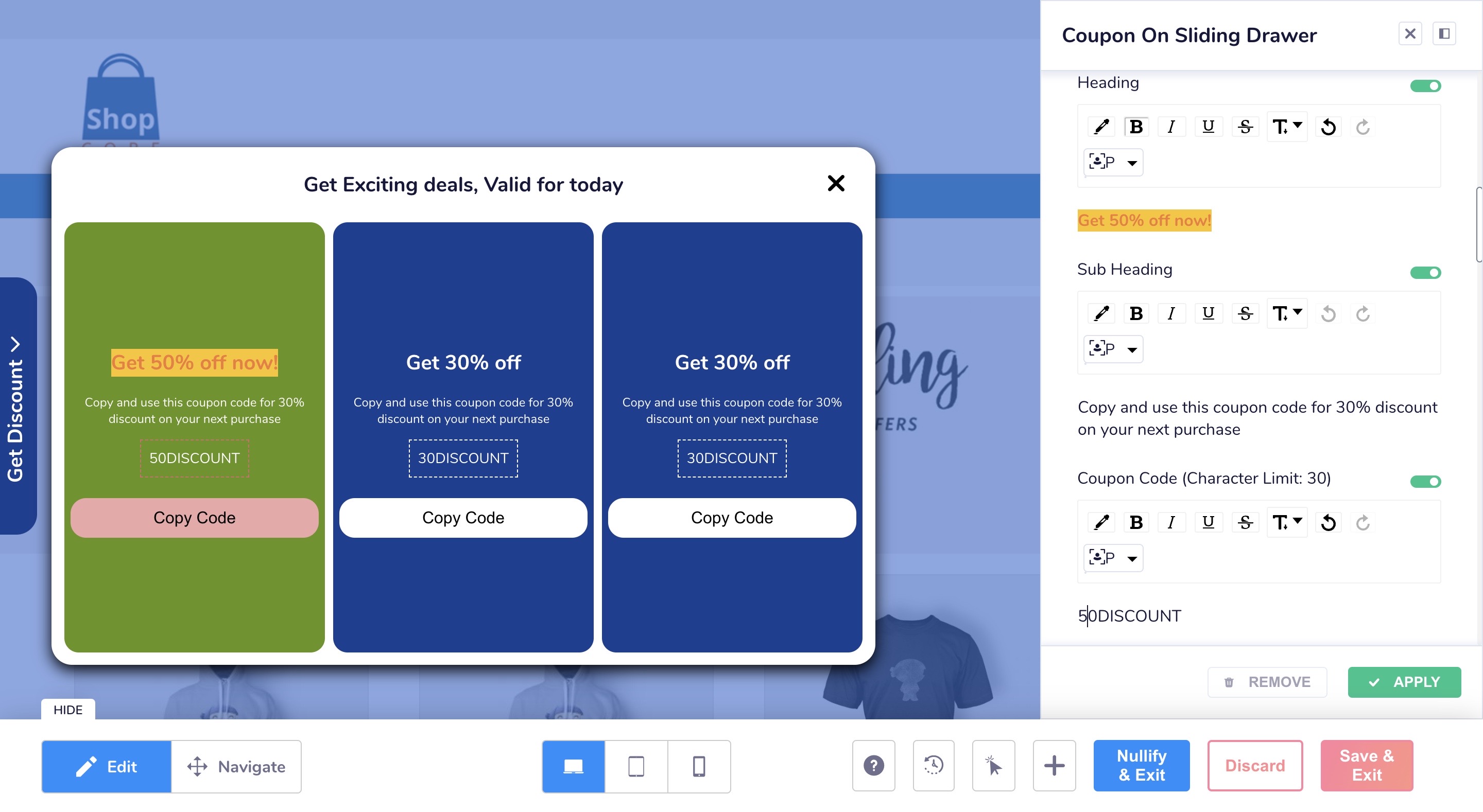
- You can add color and corner radius for the closed drawer button
- You can also set the background color of the entire coupon drawer as well as the for closed drawer button.
- For each coupon, the background color, corner radius, color of the button can be chosen.

Back to Top icon
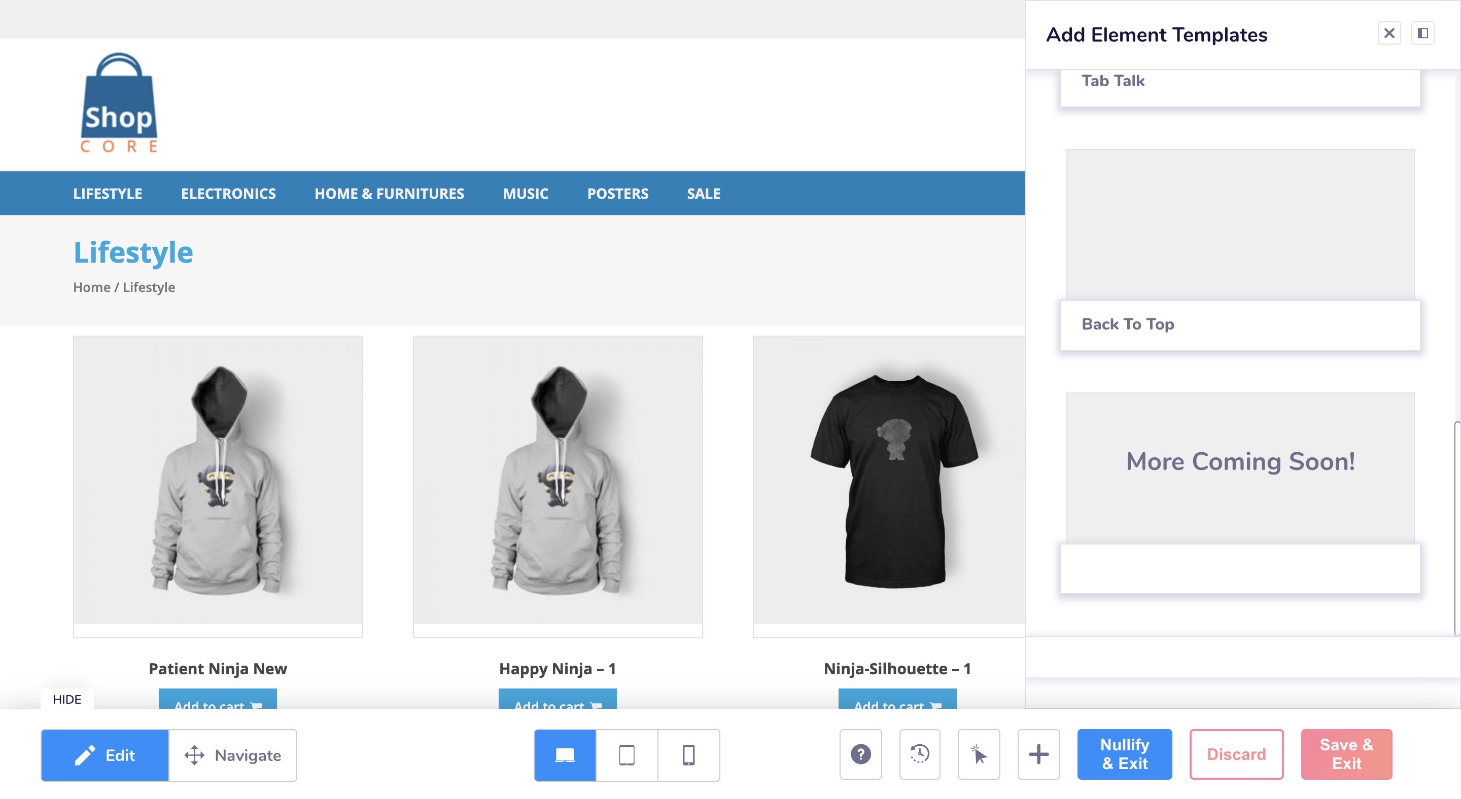
The 'back to top' icon allows users browsing your website to go straight to the top of a page where they have been scrolling.
How to set up a back to top icon on your website?
Position
Here you can set where you want to place the 'back to top' icon on your product listing page. There are 3 options available here: right, left and center.
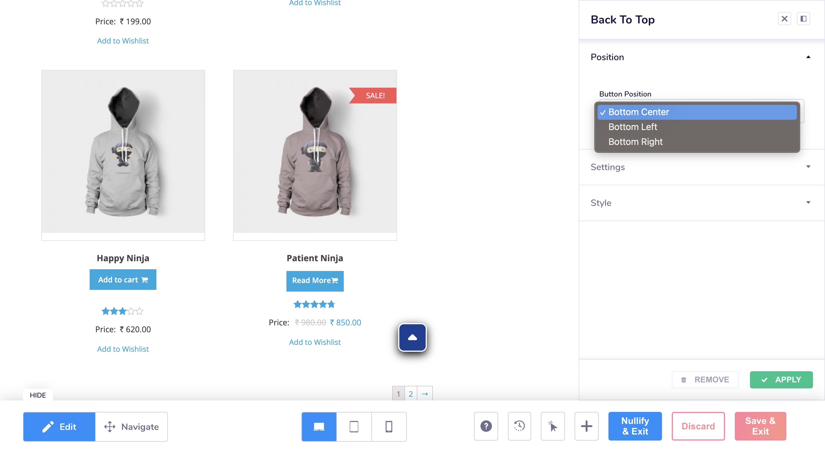
Settings
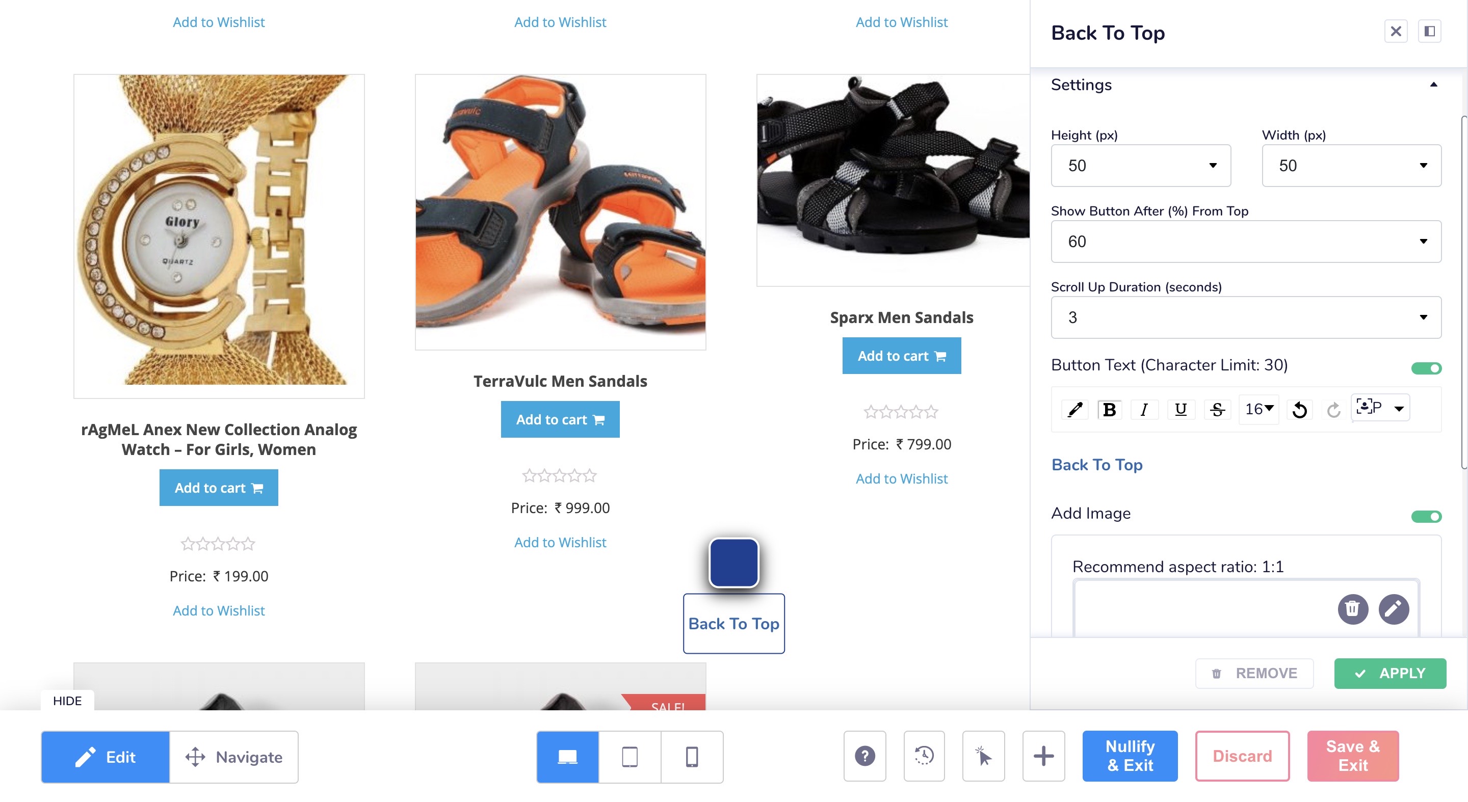
- In this section, you can set the height and width of the icon.
- 'Show Button After (%) From Top' - let's you set up when you want the icon to start showing on our page after the given percentage of the page has been scrolled.
- 'Scroll Up Duration' - time taken to scroll back to the top of the page.
- 'Button text' & 'Add image' toggles which allow you to add text or images to the icon optionally.
Style
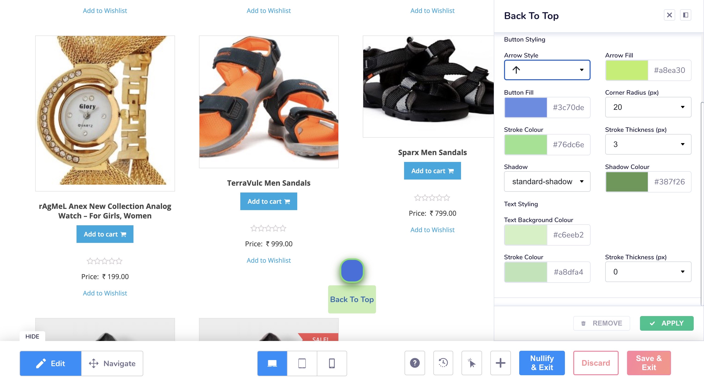
- Button styling - You can add an arrow to the icon and also add color and border for the same.
You can also set the icon color, corner radius, border and shadow as per your needs. - Text styling - You can also choose the color and border color for the text of the icon if you have added any.
Tab Talk
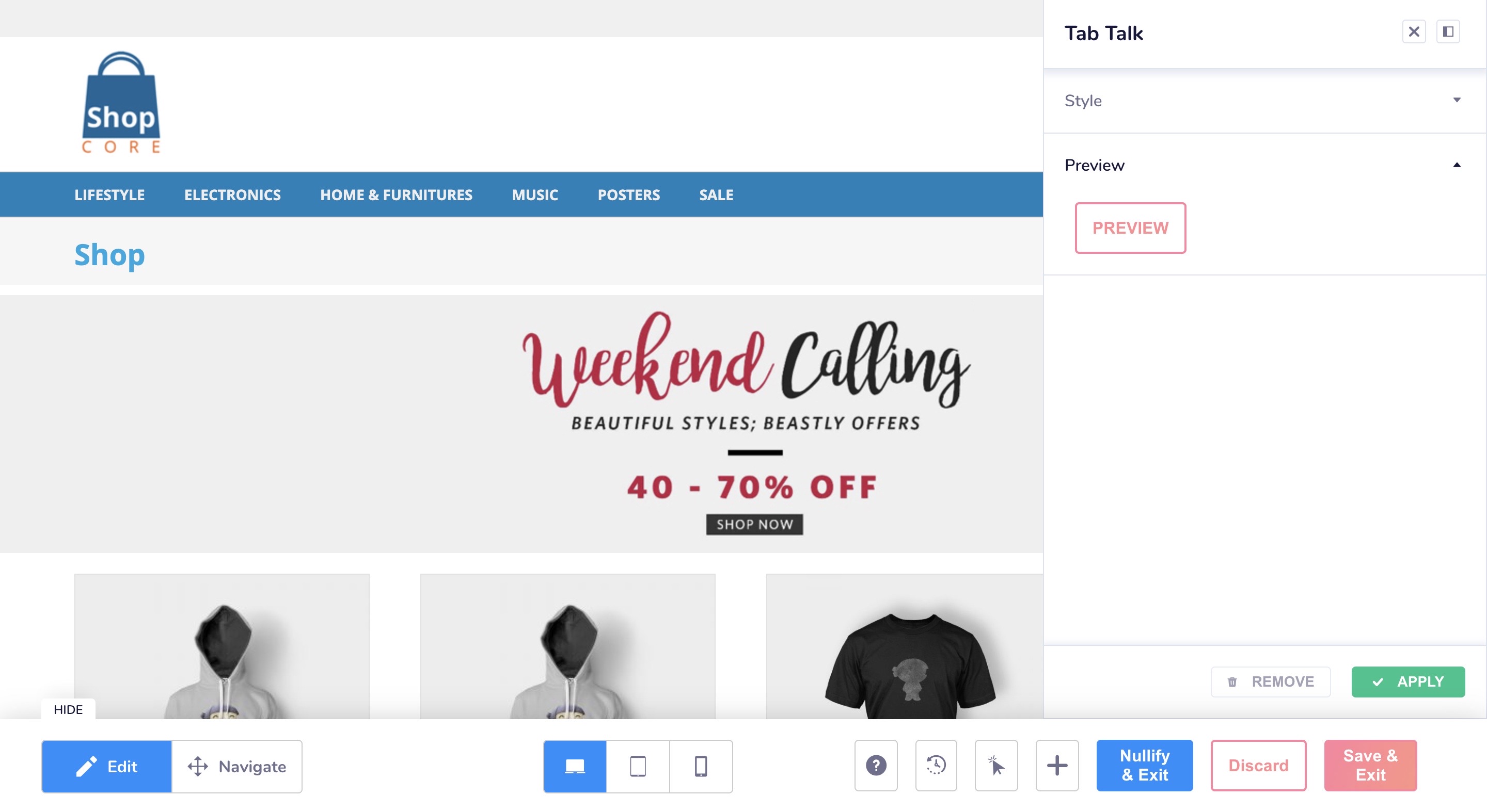
Tab talk is a simple but effective webpage element that can be used to get users back to your website. When a user leaves my website and moves to another tab, this should highlight the tab flashing any message I choose to show, so that they come back to my website and continue from where they left off.
How to set up a Tab talk element?
Style
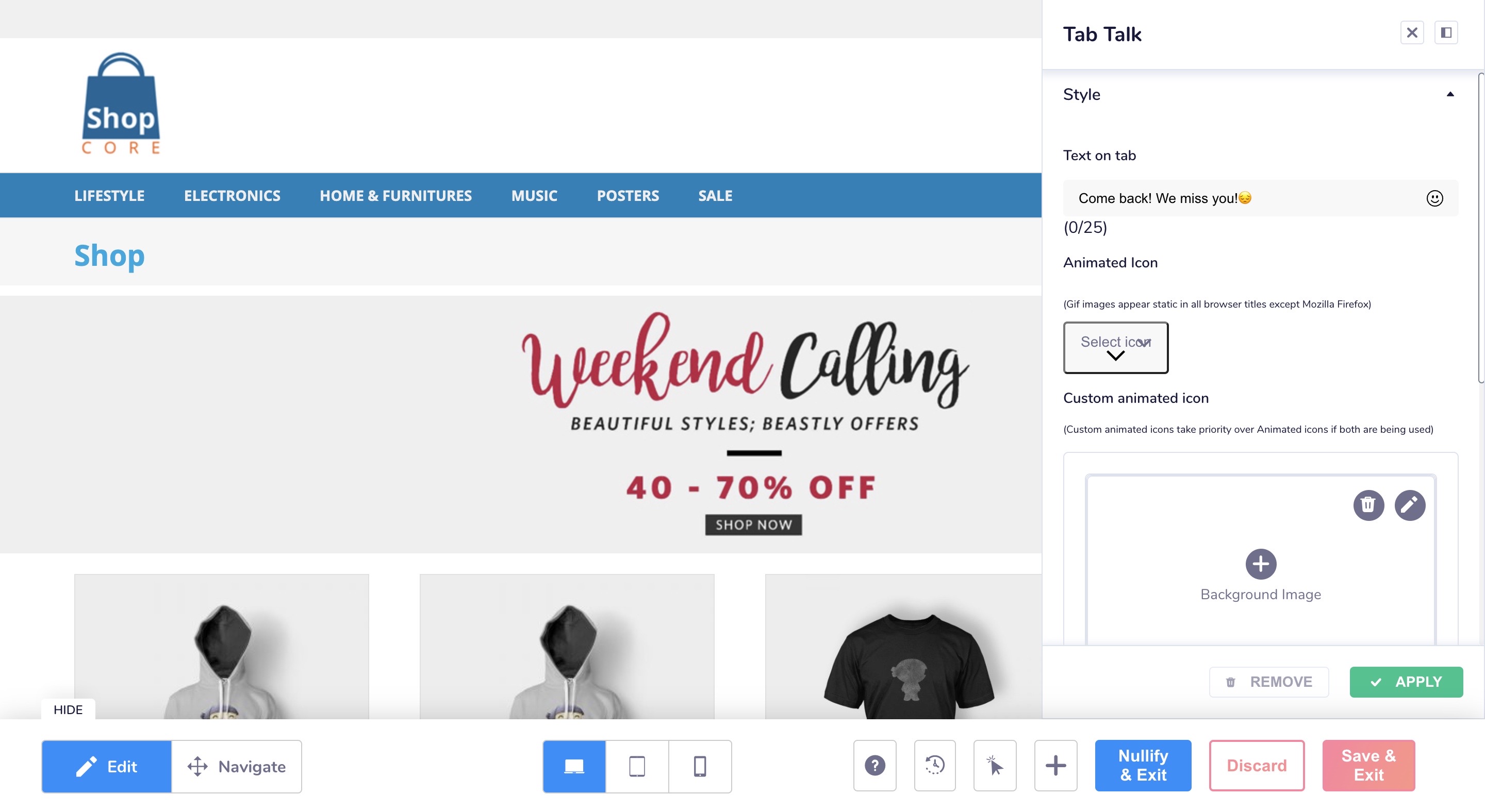
- Here you can add the text that you want to flash on your tab.
- You can also add any icons or GIFs or add your won image or your brand logo to the tab.
- You can also choose the animation style for the text to appear on your tab, it can either be scrolling or blinking.
Preview
- In the preview section, there is a 'preview' button clicking on which will open up another tab on your browser and show the actual message on the current tab.
Progress Bar
You can add a Progress bar to your PDP pages so that you can show how the no. of items are increasing or the amount is increasing when the user adds different products to the cart to achieve the threshold to avail different offers and discounts on the website.
How can you set up progress bar?
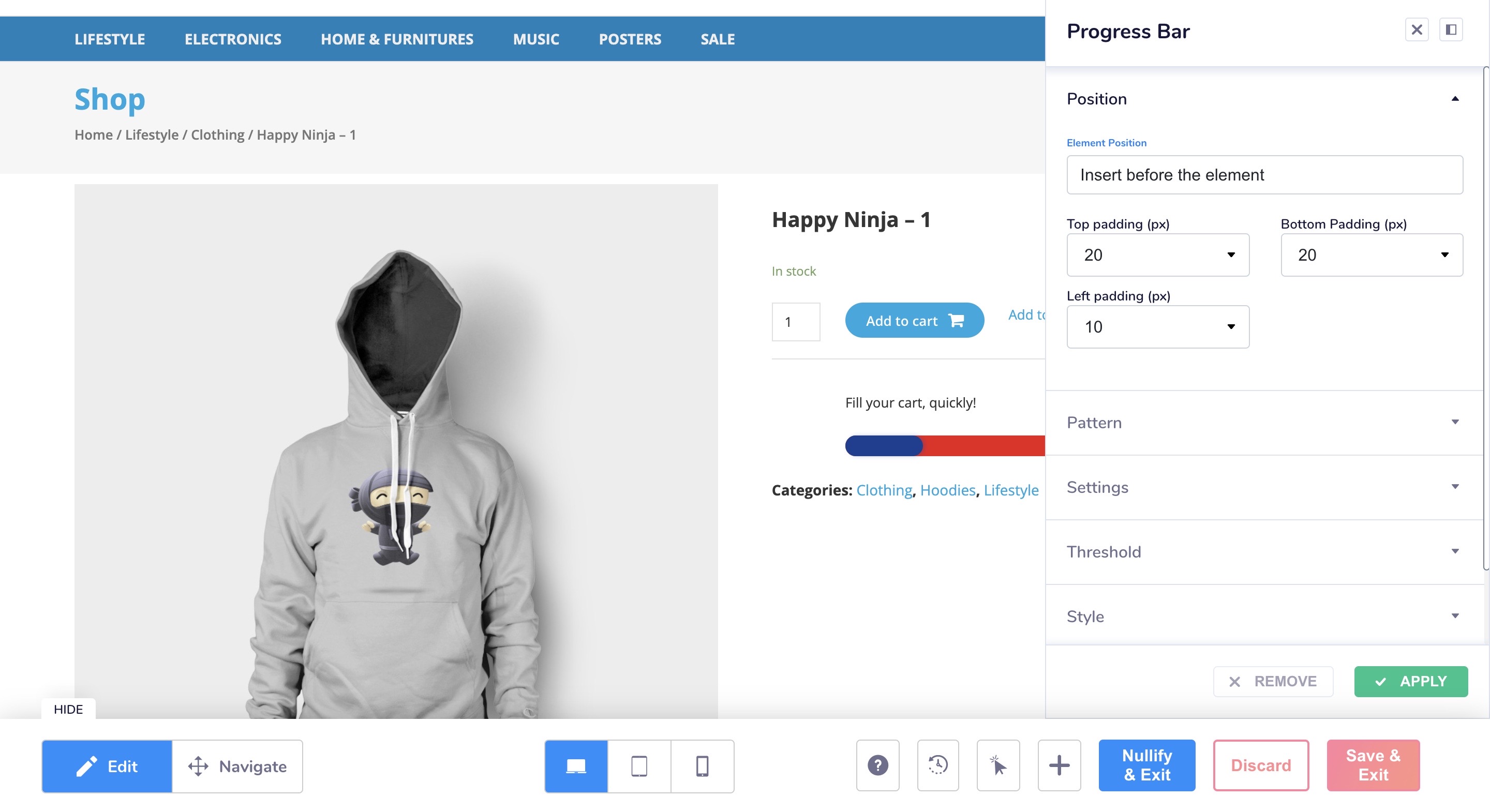
Position
- Element position - To select where we want to place the progress bar, above or below the selected reference element.
- Top padding - to adjust the padding of the progress bar from the top.
- Bottom padding - to adjust the padding of the progress bar from the bottom.
- Left padding - to adjust the padding of the progress bar horizontally, the padding cannot go beyond the edges of the parents element.
Pattern
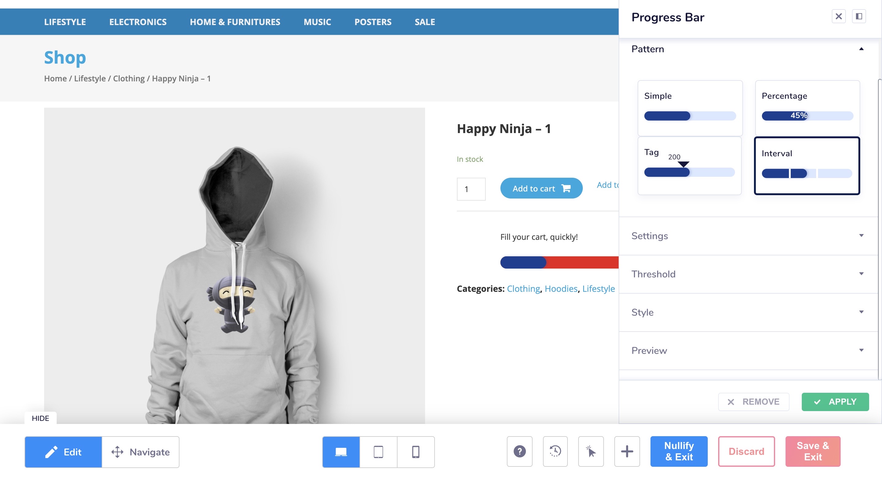
The type of progress barm there are 4 options here:
- Simple - the progress bar will fill in simply, not showing any other text or tags.
- Percentage - the progress bar will also display the percentage of how much is filled
- Tag - the progress bar will show any special tags the marketer wants to highlight
- Interval - the progress bar will highlight the intervals
Settings
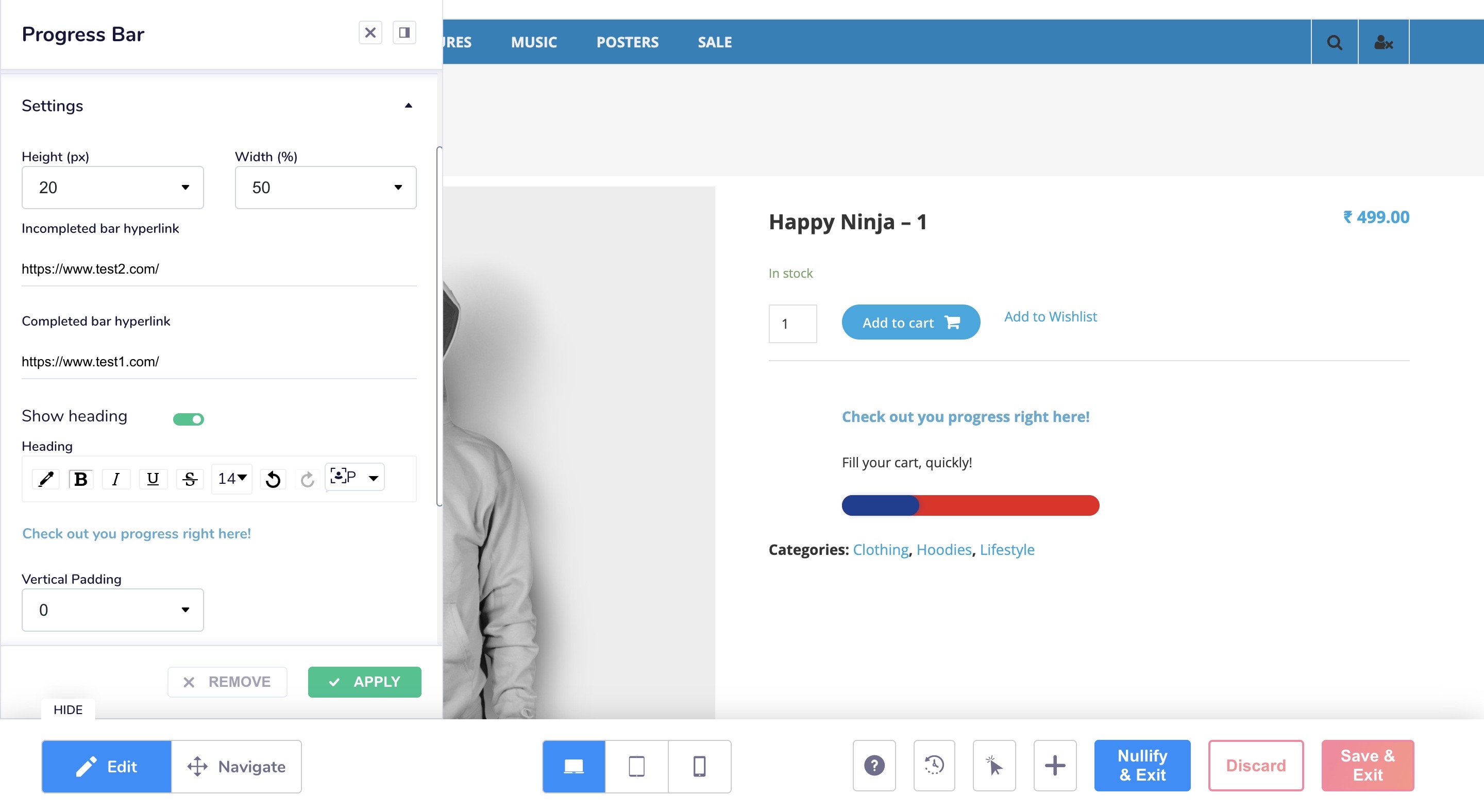
- Height - The height of the progress bar can be set here.
- Width - the width of the progress bar can be set here.
- Incomplete bar hyperlink - clicking on the progress bar while it is filling would take the user to the given link
- Complete bar hyperlink - clicking on the progress bar after it is filled would take the user to the given link
- Show heading toggle - heading can be added if the user wants.
- Vertical padding - enabled only for the heading. It is to set the vertical padding of the heading from the progress bar.
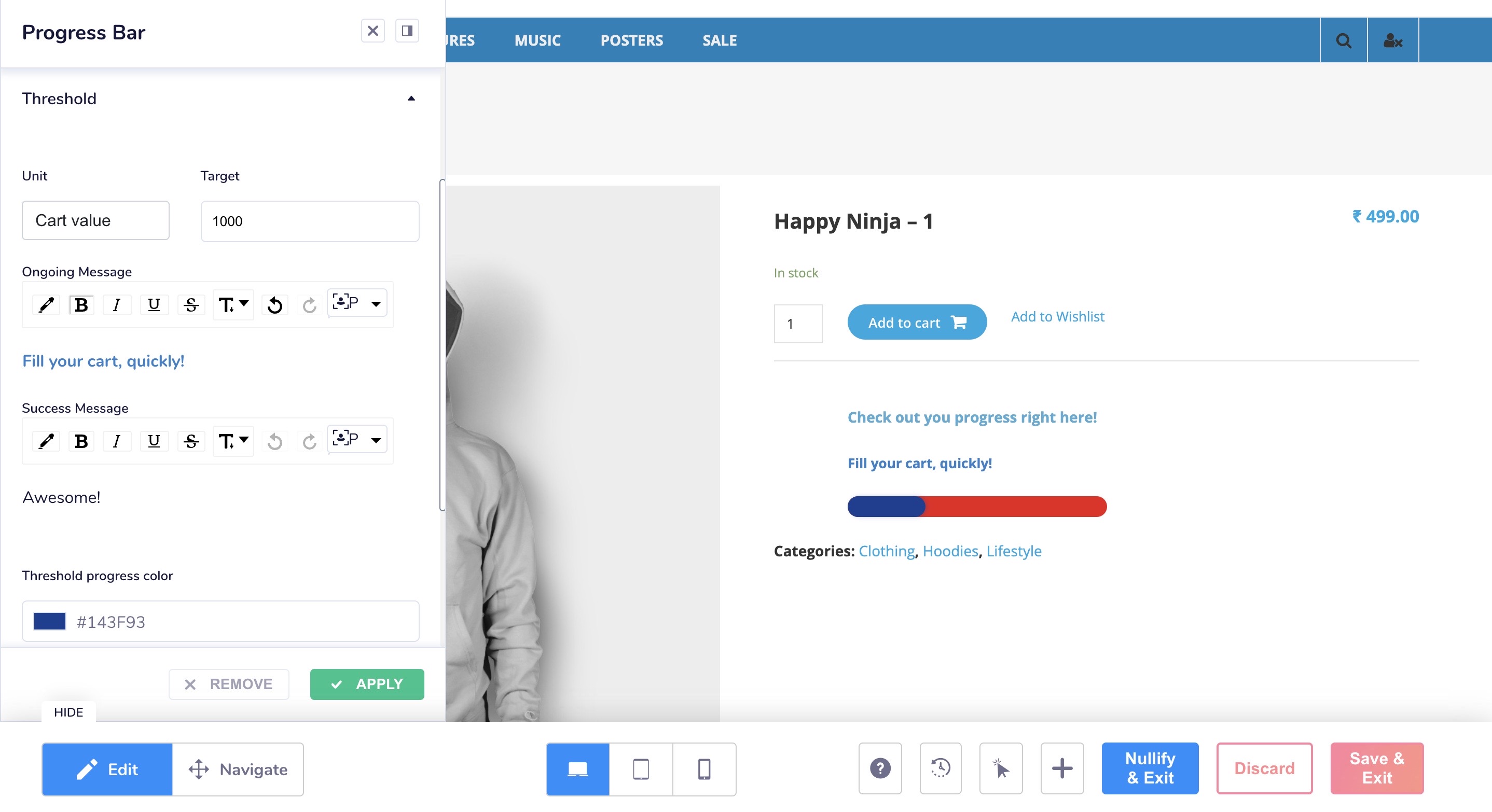
Threshold
- Unit - User can set in what value will the progress bar be measured, two options available are cart value (total amount of products added to the cart), cart quantity(quantity of product added to the cart)
- Target - the threshold value upto which the progress bar needs to fill up
- Ongoing message - Message to be shown while the progress bar is filling
- Success message - message to be shown once the progress bar reaches the target value
- Threshold progress color - The color of the progressing bar.
NOTE : In the ‘interval’ type progress bar, user can add upto 4 threshold values. The progress bar should be divided equally into the number of thresholds added.
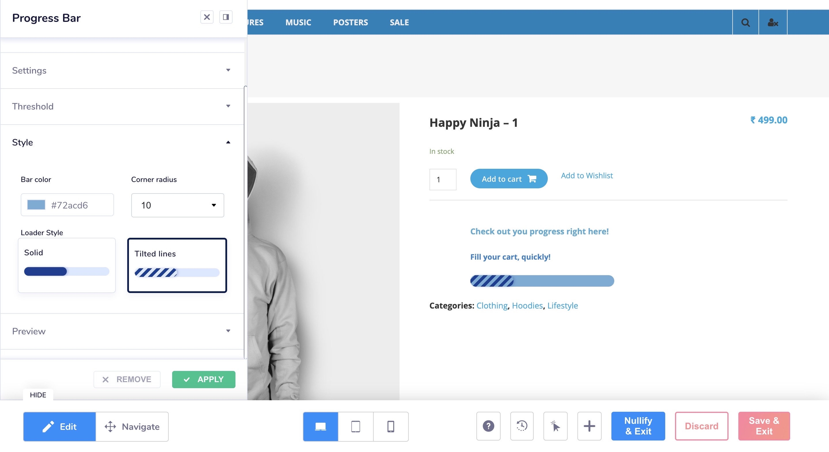
Style
- Bar color - colorof the progress bar’s background
- Corner radius - radius of the progress bar’s corners. Values (10, 20, 30,……100)
- Loader style - How the progress bar pattern should be, either solid or tilted lines.
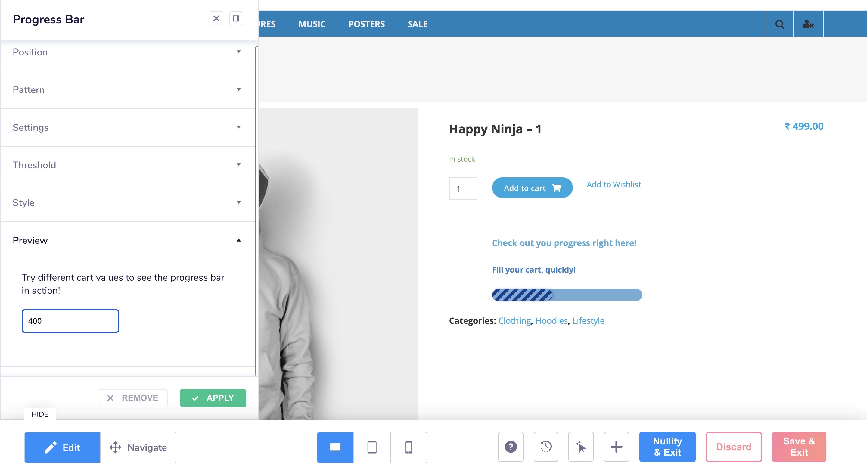
Preview
- Here you can type in different values manually to check the working of the progress bar.
Updated 5 months ago
