A/B Campaigns Report for Website Personalization
Now you can see the performance of all your A/B experiments that you run on your website for Personalization.
A/B testing is a marketing experiment wherein you split your audience/users randomly to test and compare two versions of a website to determine which performs better.
In this case, one version would have only your native widgets shown to users, no personalisation done. The other version would have all the personalisation widgets powered by Netcore’s AI engine shown to the users.
In this dashboard you will be able to see the performance of your A/B campaigns based on different metrics.
You can navigate to this dashboard from Campaigns -> On-Site Engagement -> Onsite Recommendation and select “A/B campaign” in the Campaign type filter.

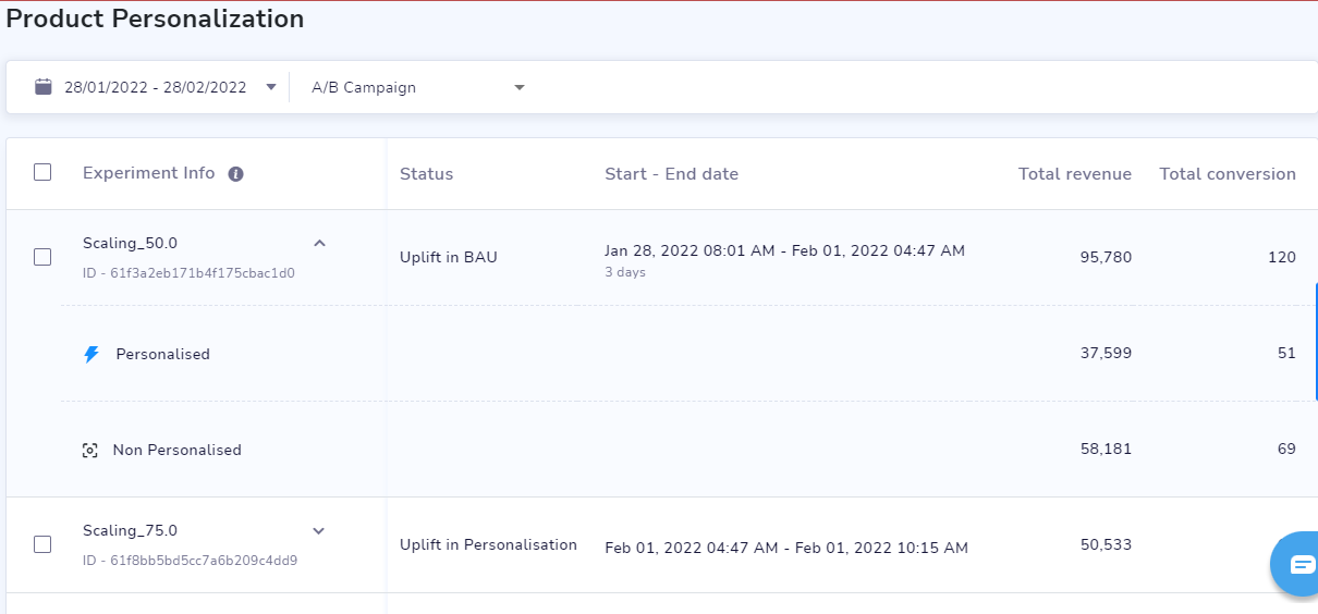
The first page will show you the list of all the A/B experiments which are running or completed. You can use the date filter to look at them in a time period within the last 4 months.
Other metrics shown are:
Status - When the campaign is ongoing, the status would be ‘Running’ and once the experiment is completed, it would show the final result of the experiment which could be one of the following three:
Uplift with Personalisation - when the personalised variation has performed better.
Uplift with BAU - when the control group has performed better.
No uplift- when both groups have performed equally.
Start-End Date of the experiment.
Total revenue - Total revenue generated through the entire campaign. You can also see the split between personalised and non-personalised groups by clicking on the down arrow on the experiment name.
Total conversion - Total conversions is the total number of purchases done through this campaign which is again split between personalised and non-personalised.
Total user - Total number of users who were targeted for this campaign. It is split between personalised and non-personalised as well.
Detailed view for each experiment
You can further click on any on these experiments from the list to get a detailed analysis of it,

There are two tables pertaining to two goals:
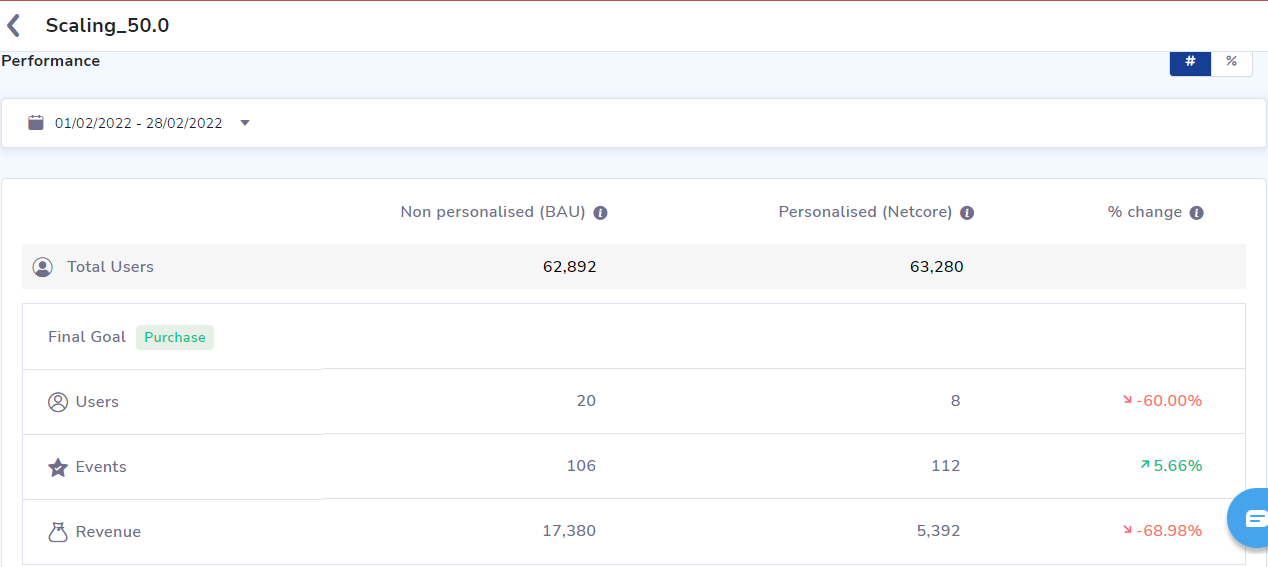
Final Goal (Purchases) - Here we can see the comparison between the personalised and non-personalised variations in terms of the total number of users targeted in each, number of users who have made a purchase(Users), total number of purchases (Events) and the total revenue generated (Revenue).
The ‘% change’ column shows the percentage of increase or decrease brought by the personalised variation as compared to the non-personalised variation.
Interim Goal (Add to carts) - The same metrics are shown here but for Add-to-carts done.

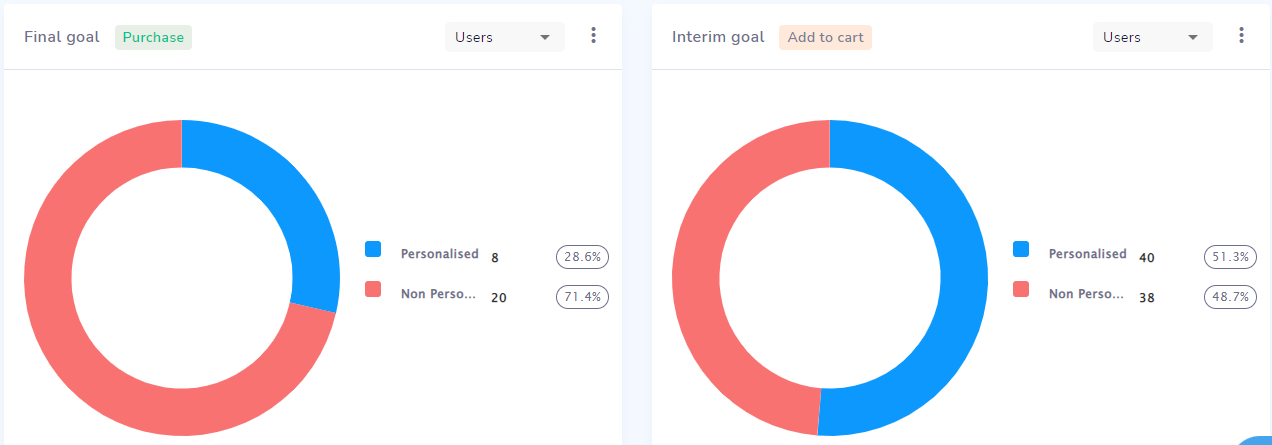
You can also see how each variation contributes to the total through this pie-chart representation for each metric namely : users, events and revenue using the drop down list.
There are two charts for two goals, final and interim respectively.

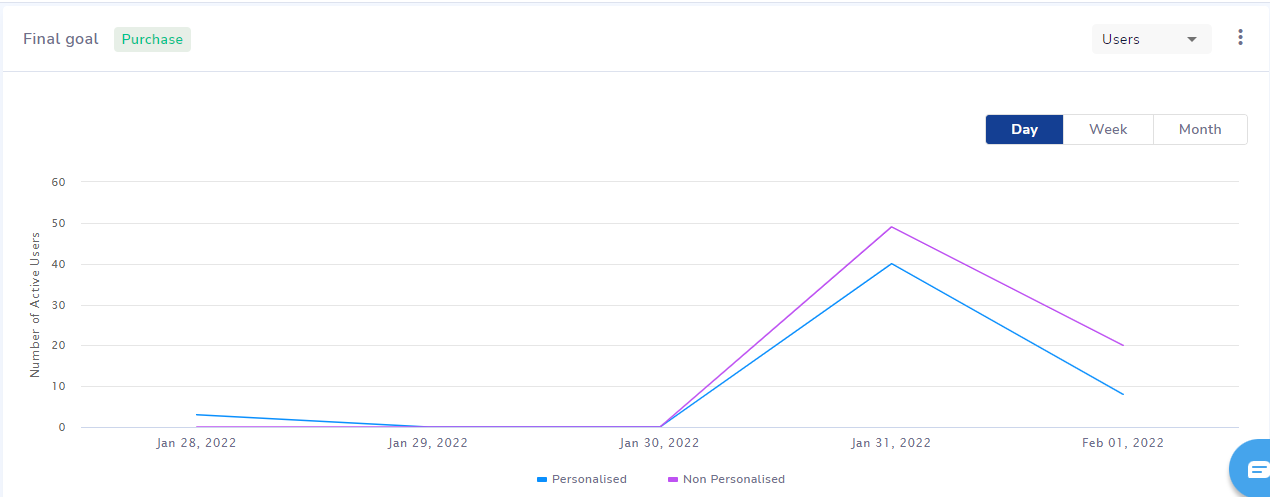
These timeline graphs can help you observe the day to day comparison across all the 3 metrics between personalised and non-personalized variations.

Updated 5 months ago
